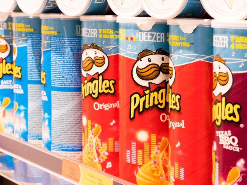
Pringles Packaging Outrage: Consumers Are Outraged Over Sustainability
This week Pringles’ branding and packaging underwent radical changes that outraged loyal fans. Pringles is one of the most beloved and longstanding properties in FMCGs. It was the first time Pringles had changed ‘Mr P’ – their mascot and the main focus of their packaging – in twenty years. The changes met huge backlash. Brands must not let the dazzle of modern branding initiatives blind them to the familiarity and comfort value their products already have.
Pringles followed the modern packaging playbook
It is easy to see how Pringles decided to make the changes they made. Both were consistent with today’s standard marketing practice. The company updated its logo to a simple, bold and borderless design that resembles an emoji. Pringles did not make a glaring error. It overlooked something subtle but vital. There is value in the lack of historic change. Consumers draw comfort from the familiarity of these brands. Consumers are fond of Pringles precisely because it hasn’t changed in so long. In these cases, rebrands, no matter how flashy, can only harm things.
Go deeper with GlobalData

It’s happened before
Tropicana’s attempted 2009 rebranding effort is the canonical example of packaging overhauls gone wrong. The redesign cost Tropicana $35m but was so poorly received that it was reverted. In the two months that the redesign was active, sales fell by 20%, which cost Tropicana another $30m. Twelve years later, the incident is still known as ‘the Tropicana crisis’.
How to know if your brand has familiarity value
Consumers have an intuitive sense of which brands hold familiarity value. They’re the Fairy Liquids, Heinz Beans, Quality Streets and Dairy Milks of the world. The difficulty for these brands is knowing how to pursue growth without changing their product.
Emphasise history and familiarity
This lack of marketing options is a good problem to have; it only applies to very well-established incumbents. The best strategy is not to rebrand, and instead to launch marketing campaigns that remind customers of how well they know the product and trigger a sense of fondness. Heinz executed this very well in an advert for Ketchup. The ad featured several scenes of arms and hands using Ketchup, but with the Ketchup itself invisible. So viewers saw hands twirling a knife upwards, squeezing and bringing the heels of their palms down onto empty space. Yet they also knew exactly what was missing in the image, Heinz Ketchup.
Marketing material can also highlight the brand’s endurance. Ketchup branding prominently features its 1869 date of establishment.
Remember that the old way might be best
Pringles made the rebrand to celebrate the 30-year anniversary of its UK launch. It should have used the moment to further and reemphasise its familiarity. Companies must recognise when they have familiarity value and be careful not to disturb it.