
In a retail market that places a heavy premium on consumer brand awareness, the hard-won heritage of long-established products is a key selling point. Brands like Coca-Cola and Heinz have spent decades carving out an exclusive niche in their customers’ thoughts, to monopolise their attention on busy store shelves.
Packaging design is perhaps the most direct means of reinforcing that heritage, with familiar brand colours and design touch points providing an instant, almost Pavlovian indication of the product within. The best heritage packaging succeeds by acting as a gateway to the customer’s memory, evoking a sense of trust and brand loyalty with a minimum of clutter.
But even the most successful brand packaging needs to move with the times. Coca-Cola might have retained its trademark signature and colour schemes over the decades, but it still periodically updates the design of its cans and bottles to better reflect the aesthetic and environmental priorities of the modern world. And for long-standing products that have lost ground in the market due to new competition or shifting consumer expectations, a well-considered packaging design update can help re-establish a brand, or even bring it back from the brink.
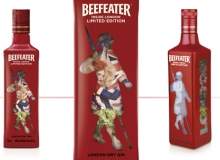
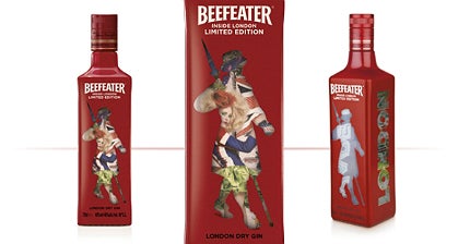
London-based brand design agency Coley Porter Bell has a wealth of experience working with iconic brands, carrying out packaging redesign work for heritage customers such as Cadbury, Hellmann’s and Nestlé. Highlights of the company’s work in the last few years include its repackaging of John West canned tuna, which evoked the client’s 150-year history to help boost sales by more than 20%, as well as a limited edition ‘Inside London’ packaged bottle for Beefeater Gin to celebrate a momentous 2012 for the UK capital.
We spoke to Coley Porter Bell’s planning director John Clark, to get a sense of the fine balancing involved in redesigning heritage brands.
Chris Lo: What are the best reasons for a brand to consider a packaging design overhaul?
John Clark: Broadly the good reasons are strategic ones, understanding where the brand is now and where it wants to be, and how much the pack is reflecting that position. Usually, the good reasons fall when there’s a gap between those two things. Brands are dynamic; they change all the time.
Sometimes the packaging just hasn’t caught up with where the brand needs to be. That could be because they’re taking a decision to move on or reposition to target a new audience, or it could be something that’s happened in the market – technology’s changed, competitors have changed, dynamics have changed, and they’ve become depositioned in some way.
When it’s for those reasons, and it comes from a point of understanding with a clear view and a vision and a strategy, then it’s generally done for good reasons, I’d say.
CL: And what about the worst reasons – how important is it to recognise when a brand isn’t broken and doesn’t need to be fixed?
JC: The bad reasons are basically the inverse of those, when people are changing for change’s sake, or somebody’s got caught up with the latest zeitgeist [and] wants a bit of that for their brand. Sometimes you’re saying, ‘Hold your horses a little bit, it may be very fashionable, but actually it’s not really what your brand’s about, it’s not really why consumers are buying into your brand.’
Just slapping a bit of whatever the latest thing is on top of your brand is going to be a sticking plaster at best and disastrous at worst. When it’s the more flighty, fashionable reasons, sometimes you’re in the situation where you’re trying to put the brakes on a little bit, or at least open up the discussion.
CL: How difficult is it to strike a balance between a product’s heritage and the new elements you’re trying to introduce?
JC: That’s the million dollar question, most of the time. Unfortunately, it’s not a science. It’s a mixture of hard and soft skills, which I guess is why the agency exists. The key thing is making sure that everyone understands the brand, that people really understand the consumers and their relationship to it, and the context in which it’s operating, rather than looking at it in a vacuum.
Again, it’s getting an idea of where the brand is, where it wants to go, and if you have to reinvent everything to get there. Do you have to introduce new elements, or is it a case of just updating or contemporising what the brand is about? That’s more often the case – brands pretty much stay true to themselves, they just reinterpret and reinvent how they tell their story. So it’s balancing those, but it’s tricky.
CL: How have you approached this balance on previous projects?
JC: John West was a relatively slight redesign. John West were in a situation where they were facing competition both from own label and another branded competitor. What was happening at the shelf was that people just saw the market as commoditised – a can of tuna was a can of tuna. And there was nothing that was forcing that differentiation and making the case as to why they should pay more for John West.
What we did is dive into the brand, the heritage and the history. We understood the amount of time that that brand had been going on for, the understanding they had of the sea and of fishing. We found within that a story that was worth telling and bringing to life. So we brought the ‘Since 1857’ date on to it, we introduced the fish market graphic on to the can, all of which was to speak to their heritage and their history. Digging into the brand, bringing that out and bringing that story to life has been really successful for them, and it’s something they’re now spinning off.
At the other end, Dylon was sort of an unloved brand. It kind of hadn’t kept up; it was under threat of being delisted. It really needed a fundamental overhaul. That was a lot broader a brief, so it was about exploring different potential positioning to try and make Dylon resonate with today’s consumers.
So do you bring out the craft aspect of the brand, do you talk about colour expertise, do you talk about change and reinvention? It was really exploring what Dylon could mean to its target audience. Once we’d understood that, that was half the story there. Once we’d got that, we just brought it to life in design. But that was a lot more exploratory; we undertook a couple of rounds of research to understand what would work best for the future.
CL: What was the thought process behind the limited edition ‘Inside London’ bottle that you created for Beefeater Gin, which seems to blend tradition and modernity?
JC: This one’s dear to my heart – it was actually the first project I worked on when I got here. Limited editions are always important to alcohol brands, particularly in the global duty free market. And [with] 2012 being such a big year for London, it was really important for Beefeater that they capitalise on it.
We wanted to have an offering out there that people around the world, with London in the headlines, could see and take their own little bit of London away. When you look into the brand, Beefeater’s the only big international London dry gin brand that’s still actually distilled in London.
That was the start of it, because that gives it real insider status, real local status. If you want to know London you ask a Londoner, and we were the only gin brand that could be that Londoner and give you the inside view. So from there, it was all about projecting the fact that Beefeater has the inside view on London.
As you see in the finished package, that was all about painting a vivid picture of what the real London is like in all its creativity and eclecticism, using the clever shrink wrap so you literally view it through the Beefeater, through the window on the outside. But it all came out of the brand’s foundation as the only true ‘distilled-in-London’ London dry gin that’s still around.
CL: To what extent can a well-considered rebrand help improve a product’s market share?
JC: If it’s done right, it can be incredibly effective. The case studies I’ve been mentioning today – the John West one took it from a struggling number three back to the number one position. The Dylon one took the brand from being threatened with delisting, to both massive growth – they were in 24-25% growth in sales – but also more importantly they managed to expand their range.
They went from just dyes to more colour care and clothes care stuff. So that gave the brand a whole new lease of life. We always try to make sure we’re very clear on the business objectives and follow up from the back.
CL: Even if a brand is relatively new, can evoking heritage and provenance be a good device to attract new customers?
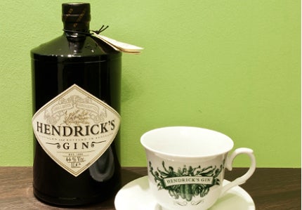
JC: Again, done in the right way, done in a credible way, it can be massively effective. The brand that springs to mind most easily is Hendrick’s, a relatively recent product launch that borrows really heavily in the packaging design from that Victorian apothecary sentiment.

In its wider brand world, there’s that Victorian ‘steampunk’ look that you see in a lot of its touch points. That’s massively successful. So done well, and done at all the touch points, you can almost have an instant heritage if you’re smart about it.
CL: Presumably consumers are quite savvy when they feel a brand is being dishonest.
JC: Provenance is easier, because if you’re actually from a place, it’s just about deciding which aspects of that place are appropriate for your brand. That’s usually a less tricky thing to pull off.
Trying to imply a heritage that the brand hasn’t got is a less common occurrence and something that’s harder to do. Hendrick’s has managed to do it because of the category it’s in. Gin has got a rich heritage in this country and it could appropriate some of that. But there are obviously examples of people that have appropriated a bit of heritage and it just hasn’t fit. And consumers aren’t daft – they’ll see through you and they’ll reject you soon enough.
Related content
Pulling off a packaging redesign: learning from Innocent and Tropicana
Brands are refreshing their designs more than ever before, but in today’s market very few actually pull it off.
Transforming tequila – Osborne Pike on the Casa Sauza redesign
‘Building brands you can believe in’ – design agency Osborne Pike shares with Gina Baksa the story behind their successful re-branding design for premium Casa Sauza XA (extra anejo) tequila.


