
With packaging development requiring such a long lead time, designers have already undertaken the bulk of their work for the 2015 ranges. But given the intricate impact that social trends have upon appealing packaging design, the support of trend prediction companies is often called upon.
Enter Laura Perryman, Global Color Research director of creative projects, who provides aesthetic trend predictions for industries as diverse as interior design and packaging.
She believes that one of the key trends for 2015 will be in reaction to the years of austerity that occurred following the 2008 recession. While packaging has for many years taken a subtle and muted approach, the time is now right for something more sensorial and fun.
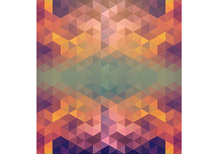
The trend, which Global Color calls ‘sensorial overload’ is highly playful, but in quite a grown-up way: a kaleidoscopic colour palette is combined with crafted details and careful finishes to produce packaging that gives a high perception of worth, while exciting the senses.
Austere reaction : craving a sensory richness
At its heart, this trend is highly reactionary, marking a key shift aware from the austerity-influenced designs of the past years.
"I think there have been a lot of trends over the past 3 – 5 years that are quite subtle, paired-back, and that’s been because of the economic environment, people not wanting to spend too much but also not wanting to show off what you have," explains Perryman.
However, Perryman believes the tide is turning, with people once again craving sensory richness.
"I think this is something that is coming back, which is connected with crafts making, playfulness with materials, and people are wanting to enhance the moods of products and also their experience of those products, so this idea of visual tactility is definitely coming back," she adds.
"That’s visual as well as through touch, so colour and material combining to create really sensorial and really tactile outcomes."
For Perryman, this is something that is going to be evident across creative industries, as designers recognise a craving for a more rich visual experience.
"I think that will filter through into lots of different industries from interiors into architecture, into carpet design and also into packaging and the products that we fundamentally buy," she says.
Matter of craft : hyper texture
In order to create this sense of playful sensory madness, Perryman sees "hyper texture" as a vital component of the trend.
To achieve this, crafted details that make packaging feel precious and unique will be highly important, with Perryman citing embroidery, papermaking and newer, more technological model making techniques as examples of possible approaches.
"There’s a couple of examples of labelling that was embroidered instead of being printed, and I like the idea of papercraft coming back," she says.
"This idea of really beautifully-made shapes and forms that are made by hand but then layer up lots of different colours within them to make these pieces to peel back to reveal, so again this very tactile, very playful element coming back into shape."
At the finish : giving packaging a tactile appeal
Perhaps the most important design feature within the trend is finish, and Perryman believes it is this that will give packaging the tactile appeal it requires.
"I really like the idea of finish within this trend – you could have really playful executions of colour with really playful executions of graphics but actually it’s the finish that make you want to go and pick up the item or pick up the packaging, so soft-touch effects are really key, as well as contrasts," she explains.
"So it could be half and half, so high gloss and high matt kind of finishes that almost play with the colour and play with the surface aesthetic that’s underneath."
She believes that this combination of craft and finish will be most effective in accessory lines, where multiple products are tied together through common packaging.
"I think it would be really good for multi product accessories, fashion accessory packaging, sports accessory packaging," Perryman says.
"So you know when you go into a lifestyle shop, this could be definitely connected with that, the tactility being part of the labelling, it could be anything connected with that lifestyle is packaged in the same feel, so it’s kind of inherent branding, almost statement-grabbing and something you might buy into across a lot of multi-product applications."
Mainstream look : graphics and new printing technologies
With multiple colours, tactile finishes and hand-crafted details, the trend has the potential to be trapped within the luxury market with no hope of making it into mainstream packaging.
"When you’re designing for low price point products you’re thinking about well actually, I can only use two colours, or I can only use one colour… so it’s kind of a smaller effect," she explains.
However, Perryman believes that appropriate graphics and newer printing technologies, this trend can be brought to mainstream packaging.
"Actually I think this could turn on its head, especially with new printing techniques such as digital printing," she adds.
"If those prices come down and they can be brought into a lower-end price point product then I think this trend could really play out in terms of graphics and in terms of playfulness with colour, so I think this would be a really good paper trend and a really good graphic print trend."
This trend is based on Merge, from Mix Trends issue 28, Spring Summer 2015. For more information on colour and materials trends or Mix Trends go to www.globalcolor.co.uk


