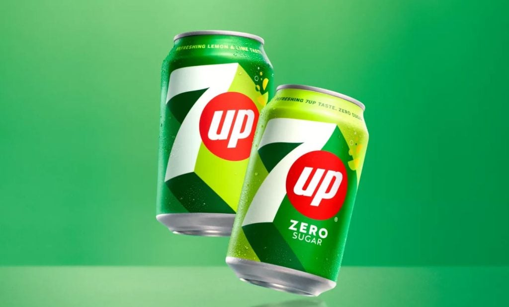
7UP has unveiled a revamped packaging design, marking the first significant update to its visual identity in more than seven years.
The redesign not only aims to modernise the brand’s look but also reflects a focus on enhancing the product’s packaging to appeal to contemporary consumers and international markets.
Heritage meets modern packaging design
The new packaging honours 7UP’s longstanding heritage as the original lemon-lime soda while introducing modern elements to reflect the brand’s evolving identity.
Central to the redesign is the retention of 7UP’s iconic green colour, which has been a core feature of its packaging for decades.
However, the new design introduces a dynamic palette of citrus-inspired hues, intended to evoke freshness and vitality, closely linked to the soda's crisp flavour.
The design team placed a strong emphasis on balancing the brand’s historical identity with modern trends in packaging.
This approach ensures that 7UP’s packaging continues to resonate with its established customer base while also attracting new consumers with a bold and vibrant look.
Packaging optimised for global markets
One key aspect of the redesign is its focus on flexibility across global markets. The updated logo features an upward-slanted 'UP' to symbolise movement and energy while ensuring that the design can be adapted for different cultures and languages.
This allows the brand to maintain a consistent visual identity across various regions while also localising its packaging where necessary.
The new design also highlights the importance of clarity and recognition in a competitive market. T
The bold contrast in colours and the refreshed logo help the packaging stand out on shelves, offering increased visibility and a fresh appeal in the beverage sector.
Enhancing the consumer experience
The new packaging for 7UP aims to align with modern consumer expectations.
Its vibrant colours, streamlined logo, and dynamic design reflect not only the product's refreshing qualities but also the brand’s renewed focus on innovation and upliftment.
By keeping the packaging simple yet impactful, 7UP hopes to create a stronger connection with consumers, while preserving the brand’s core identity.