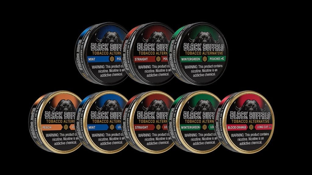
American smokeless tobacco alternative products company Black Buffalo has unveiled a bold new packaging design for its products.
The company's redesigned nicotine-containing products will be rolled out through its national network of wholesalers to leading retailers across the US from next month.
The updated colour schemes and branding elements are the result of extensive consumer research and retailer feedback.
Black Buffalo's commitment to innovation in the moist smokeless tobacco alternative and modern oral nicotine categories is reflected in the aesthetic changes, which also uphold the brand's quality and core values.
The new packaging design aligns with the company’s marketing principle of not appealing to former or non-users of tobacco.
The lid graphics will feature cohesive colourways and a design inspired by the Cape buffalo, symbolising the brand's values of loyalty, respect, and community.
Distinctive spotted colour gradients will characterise the company's nicotine pouches, indicating a clean and contemporary design.
The long-cut dip products will display a sunset-style colour halo, each unique to its variety.
In addition, the new design introduces a white icon to help adults and retail staff easily identify product formats on the backbar.
Wholesalers and retailers will appreciate that the universal product codes on cases, rolls, and cans will remain unchanged.
The new packaging design comes as Black Buffalo has seen remarkable growth in the retail channel, with wholesale shipment dollar volume soaring by more than 1,800% for the 13-week period ending 31 July 2024, compared to the first-ever wholesale shipments for the equivalent period ending 31 March 2022.


